Color System Overview
Generate accessible 12-step color palettes with automatic light and dark modes
How It Works
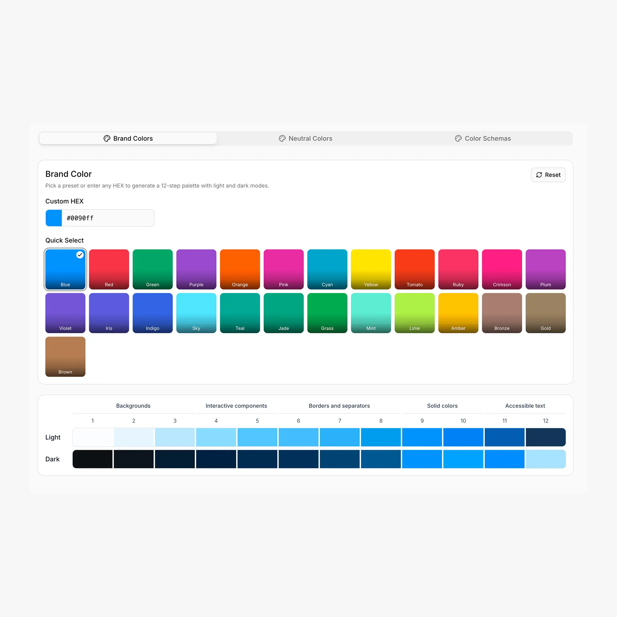
BreakColorUI builds every palette around a 12-step scale inspired by Radix Colors. You pick a single base color and the algorithm generates twelve perceptually balanced steps for both light and dark themes — no manual tweaking.
Try It
Drag through the 12 steps and toggle between Light and Dark to see how the same CSS variable renders in each theme.
Three Palette Types
A project has three independent palette types. Each one writes its own set of --hcl-* CSS variables.
What the 12 Steps Mean
The scale is split into four bands that follow the Radix Colors convention. The same step number means the same UI role across every palette.
| Steps | Role | Common usage |
|---|---|---|
| 1–2 | App backgrounds | Page background, subtle surfaces |
| 3–5 | Component backgrounds | Cards, inputs, hover/active states |
| 6–8 | Borders & focus | Dividers, input borders, focus rings |
| 9–10 | Solid colors | Primary buttons, filled badges, the "brand" color itself |
| 11 | Low-contrast text | Secondary text, captions |
| 12 | High-contrast text | Headings, body copy |
Step 9 is the brand color
When you pick a brand color, step 9 is the original hex you typed. Step 10 is a slightly darker hover variant. The other ten steps are derived from it.
.button {
background: var(--hcl-brand-9);   /* solid action */
color: var(--hcl-brand-contrast); /* readable text on step 9 (Enhanced export) */
border: 1px solid var(--hcl-brand-7);
}

.button:hover {
background: var(--hcl-brand-10);  /* slightly darker */
}
Light & Dark Mode
Each palette ships two scales — one for light mode and one for dark mode — but they share the same variable names. Switching themes is handled with a data-hsx attribute on the page (or a wrapper element).
/* Primary theme — applied at :root and to anything tagged "light" */
html:root,
[data-hsx*="light"] {
--hcl-brand-1: #fbfdff;
--hcl-brand-9: #0090ff;
--hcl-brand-12: #113264;
}

/* Inverted theme — applied to anything tagged "dark" or "invert" */
:root[data-hsx*="dark"],
[data-hsx*="dark"],
[data-hsx*="invert"] {
--hcl-brand-1: #0d1520;
--hcl-brand-9: #0090ff;
--hcl-brand-12: #c2e6ff;
}
Three selector keywords
data-hsx*="light"— primary (light) valuesdata-hsx*="dark"— inverted (dark) valuesdata-hsx*="invert"— same asdarkwhen the primary theme is light, used to flip a single section against the page
The Export tab also offers Light only and Dark only variants that drop the selectors and apply the chosen theme directly to :root — useful when you don't need theme switching at all. See Export & Integration for the full breakdown.
Variables You Can Use
All palettes share the same --hcl-{type}-{step} shape. The Standard export gives you the core scale; the Enhanced (v2) export adds transparency and semantic helpers.
/* Brand */
--hcl-brand-1 ... --hcl-brand-12
--hcl-on-brand                     /* readable text color over step 9 */

/* Neutral */
--hcl-neutral-1 ... --hcl-neutral-12
--hcl-on-neutral

/* Each custom schema (e.g. "success") */
--hcl-success-1 ... --hcl-success-12
--hcl-on-success/* Alpha variants — same scale, with transparency baked in */
--hcl-brand-a1 ... --hcl-brand-a12
/* Semantic helpers per palette */
--hcl-brand-contrast /* readable text over step 9 */
--hcl-brand-surface /* step 1 with 80% alpha — for translucent panels */
--hcl-brand-indicator /* step 9 — for badges, dots */
--hcl-brand-track /* step 9 — for sliders, progress */
/* The Enhanced export also emits OKLCH and P3 layers
inside @supports / @media (color-gamut: p3) blocks. */Custom schema names get slugified
A schema named Brand Accent becomes --hcl-brand-accent-{step}. Names are lowercased and whitespace becomes a hyphen.
Breakdance Integration
When you export with the Breakdance platform option, BreakColorUI also writes a set of --bde-* variables that map your palette into Breakdance's global color slots — --bde-brand-primary-color, --bde-headings-color, --bde-links-color, and friends.
These mappings are configured in the Tokens tab. See Design Tokens for the full list and how to override them.
Suggested Workflow
Start narrow, expand later
- Set your brand color — see Brand Colors.
- Pick a neutral that matches your brand temperature — see Neutral Colors.
- Add custom schemas for semantic states only when you actually need them — see Custom Schemas.
- Hit Save, then jump to Export to grab the CSS.