Neutral Colors
Pick one of six pre-built Radix neutral palettes for backgrounds and text
What It Does
Neutral colors are the workhorse of any UI — page backgrounds, card surfaces, borders, body text. BreakColorUI ships six pre-baked Radix neutral palettes. You don't generate a neutral; you pick one. Each palette is already a balanced 12-step scale with light and dark modes.
Why pre-baked?
Neutrals are sensitive — even a small amount of saturation in the wrong place looks off. Using Radix's hand-tuned palettes guarantees the scale stays clean and accessible at every step.
The Six Options
The palettes only differ in their undertone. Match the undertone to your brand color temperature for a cohesive look. The previews below show light-mode steps 1 → 12.
Gray
Pure neutral, no color bias. The universal choice — pairs with anything.
Mauve
Subtle purple undertone. Pairs well with purple, pink, plum, crimson.
Slate
Subtle blue undertone. Pairs well with blue, cyan, indigo, violet, iris.
Sage
Cool green undertone. Pairs well with mint, teal, jade.
Olive
Warm green undertone. Pairs well with grass, lime.
Sand
Warm yellow-brown undertone. Pairs well with orange, amber, yellow, tomato.
Quick rule
- Cool brand (blue, purple, pink) → Mauve or Slate
- Green brand → Sage (cooler greens) or Olive (warmer greens)
- Warm brand (orange, yellow, red) → Sand
- Anything, or undecided → Gray
Try It
Switch between brand colors and neutrals to see the pairings live.
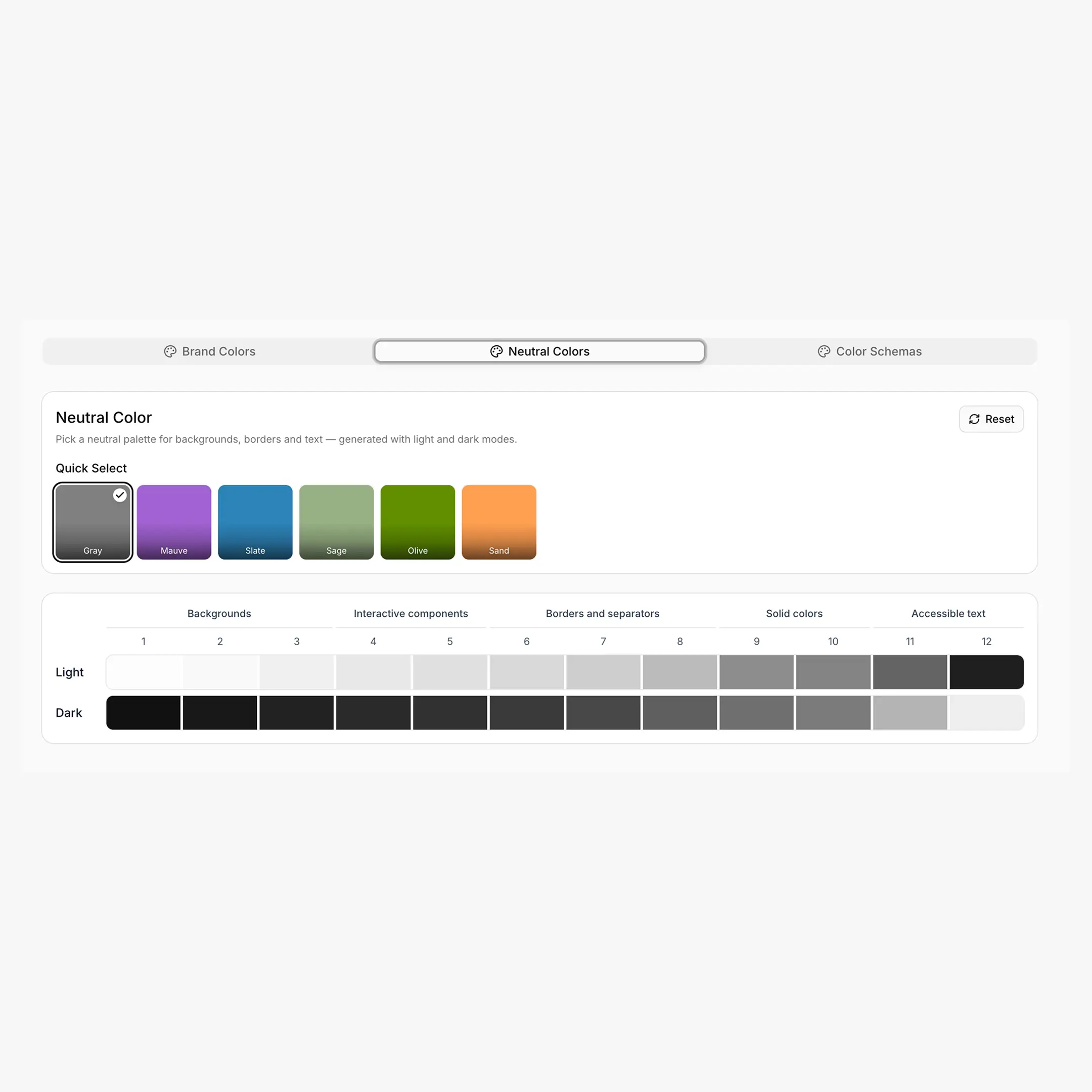
Configuring in the Dashboard
Steps inside the Colors tab → Neutral
- Click any of the six neutrals in the Quick Select grid.
- The 12-step preview below updates immediately for both modes.
- Click Reset to return to Gray (the default).
- Hit Save.
CSS Output
Neutrals share the same --hcl-{type}-{step} shape as brand colors. The variable names don't change when you switch palettes — only the values do.
html:root,
[data-hsx*="light"] {
--hcl-on-neutral: #ffffff;
--hcl-neutral-1:  #fcfcfd;   /* page background */
--hcl-neutral-2:  #f9f9fb;   /* card */
--hcl-neutral-6:  #d9d9e0;   /* subtle border */
--hcl-neutral-11: #60646c;   /* secondary text */
--hcl-neutral-12: #1c2024;   /* body / heading text */
}

:root[data-hsx*="dark"],
[data-hsx*="dark"],
[data-hsx*="invert"] {
--hcl-neutral-1:  #111113;
--hcl-neutral-12: #edeef0;
/* ...the rest of the scale inverts to match */
}
Common Recipes
/* Page + card */
body {
background: var(--hcl-neutral-1);
color: var(--hcl-neutral-12);
}
.card {
background: var(--hcl-neutral-2);
border: 1px solid var(--hcl-neutral-6);
}

/* Text hierarchy */
.heading       { color: var(--hcl-neutral-12); }
.body-text     { color: var(--hcl-neutral-12); }
.muted-text    { color: var(--hcl-neutral-11); }

/* Inputs */
.input {
background: var(--hcl-neutral-2);
border: 1px solid var(--hcl-neutral-7);
color: var(--hcl-neutral-12);
}
.input:focus { border-color: var(--hcl-brand-8); }

/* Brand accent on a neutral surface */
.callout {
background: var(--hcl-neutral-2);
border-left: 3px solid var(--hcl-brand-9);
color: var(--hcl-neutral-12);
}
Enhanced Export Adds More
If the Enhanced (v2) export is enabled, neutrals also get alpha variants and the same semantic helpers as brand colors — useful for translucent overlays and dimmed surfaces.
--hcl-neutral-a1 ... --hcl-neutral-a12   /* transparency variants */

--hcl-neutral-contrast
--hcl-neutral-surface
--hcl-neutral-indicator
--hcl-neutral-track
Breakdance Mapping
Neutrals feed Breakdance's structural slots — --bde-background-color (= --hcl-neutral-1), --bde-headings-color (= --hcl-neutral-12), --bde-body-text-color (= --hcl-neutral-11). Override the mapping in the Tokens tab.