Theme Configuration
Page layout, responsive breakpoints, and border radius presets
What the Theme tab controls
The Theme tab generates two kinds of tokens:
These are static px tokens (no clamp()) — the responsive part comes from @media overrides for tablet and mobile.
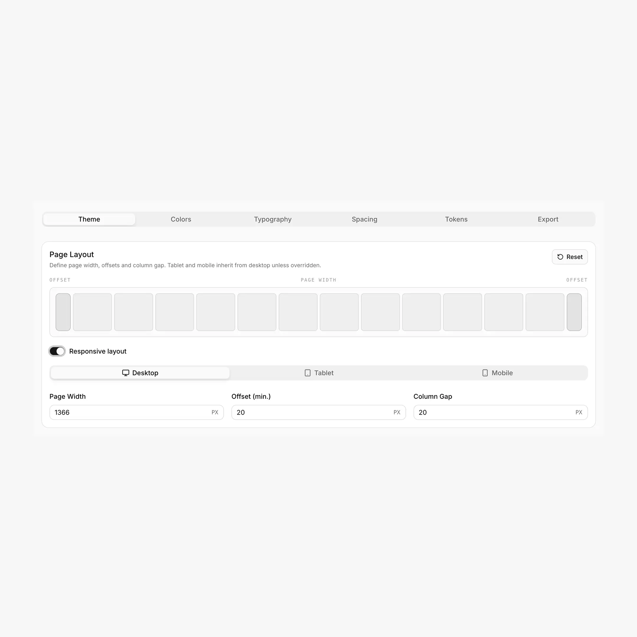
Page Layout
Three values define your page structure:
Generated CSS variables
Layout produces six CSS variables — three "design system" names plus three Breakdance-aligned aliases:
/* Design system tokens */
--page-width: 1440px;
--min-offset: 32px;
--page-gap: 24px;

/* Breakdance bridge (auto-derived) */
--bde-section-width: 1504px;            /* page-width + 2 * min-offset */
--bde-section-horizontal-padding: 32px; /* same value as --min-offset */
--bde-column-gap: 24px;                 /* same value as --page-gap */
Heads up: layout vars are NOT prefixed --hcl-*
Layout uses --page-width, --min-offset, and --page-gap (no prefix). Older docs may have shown --hcl-page-width etc. — that's not what BreakColorUI exports.
A bonus token
BreakColorUI also writes --hsx-bleed-offset — a max(...) expression you can use to align "bleed" elements with the section edge. It's automatically computed from the layout tokens.
Responsive Breakpoints
Layout supports cascading overrides for tablet and mobile, with smart inheritance built in.
Page width is desktop-only
Only offset and column gap can be overridden per breakpoint. --page-width is set once for desktop and used as the upper bound across all viewports. Tablet/mobile media queries don't redefine it.
Smart inheritance & auto-cleanup
The Theme tab persists only values that differ from the parent breakpoint. If you type a tablet offset that equals the desktop offset, BreakColorUI clears it automatically — keeping your config minimal and the cascade clean.
What this looks like in practice
- Tablet inherits Desktop unless you override
- Mobile inherits Tablet (or Desktop, if Tablet wasn't overridden)
- Any value that matches its parent is set to
undefinedin storage - Blue dot indicators on the Tablet / Mobile tabs show breakpoints with real overrides
- The "Responsive layout" toggle persists your intent even if no values currently differ
Example output
html:root {
--page-width: 1440px;
--min-offset: 32px;
--page-gap: 24px;
--bde-section-width: 1504px;
--bde-section-horizontal-padding: 32px;
--bde-column-gap: 24px;
}

/* Tablet — only what differs from desktop */
@media (max-width: 1024px) {
html:root {
  --min-offset: 24px;
  --page-gap: 20px;
  --bde-section-width: 1488px;
  --bde-section-horizontal-padding: 24px;
  --bde-column-gap: 20px;
}
}

/* Mobile — only what differs from tablet */
@media (max-width: 768px) {
html:root {
  --min-offset: 16px;
  --page-gap: 16px;
  --bde-section-width: 1472px;
  --bde-section-horizontal-padding: 16px;
  --bde-column-gap: 16px;
}
}
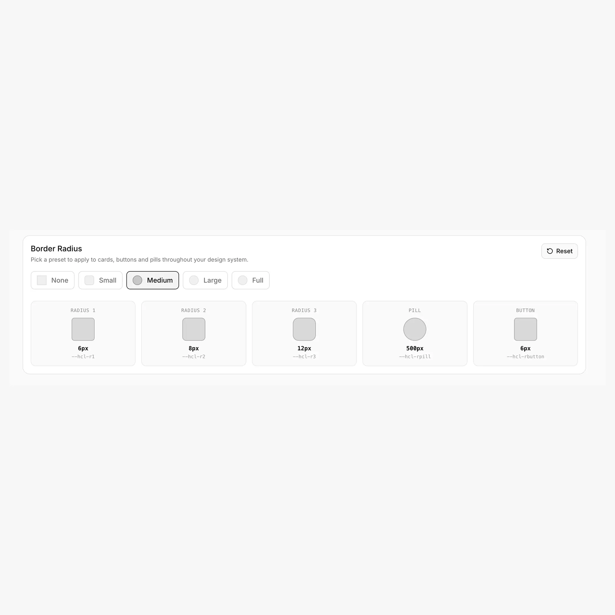
Border Radius
A single preset chooses the values for the entire --hrd-* family. Switching presets updates all five tokens at once.
Generated CSS variables
--hrd-s:    6px;     /* Small radius */
--hrd-m:    8px;     /* Medium radius */
--hrd-l:    12px;    /* Large radius */
--hrd-pill: 500px;   /* Pill-shaped (badges, tags) */
--hrd-atom: 6px;     /* Tight radius for buttons / atomic UI */
Naming note
The exported CSS uses --hrd-* (HeadSpin Radius). Inside the Theme tab, the radius preview tiles label them as "Radius 1 / 2 / 3 / Pill / Button" using the legacy --hcl-r* names — that's a UI label only. Use --hrd-s / -m / -l / -pill / -atom in your code.
Practical usage
.badge   { border-radius: var(--hrd-s); }
.card    { border-radius: var(--hrd-m); }
.hero    { border-radius: var(--hrd-l); }
.tag     { border-radius: var(--hrd-pill); }
.button  { border-radius: var(--hrd-atom); }
Configuring Theme
Configuration steps
- Open the Theme tab of your project
- Set Desktop layout — page width, offset, column gap
- (Optional) Toggle Responsive layout — unlocks Tablet + Mobile sub-tabs
- Override only what changes — empty fields inherit from the parent
- Pick a Border Radius preset — None / Small / Medium / Large / Full
- Hit save — the global save button appears once you've made changes
Putting it together
.container {
max-width: var(--page-width);
padding-inline: var(--min-offset);
margin-inline: auto;
}

.grid-3 {
display: grid;
grid-template-columns: repeat(3, 1fr);
gap: var(--page-gap);
}

section { padding-block: var(--hss-l); }
.hero   { padding-block: var(--hss-xxl); border-radius: var(--hrd-l); }
.card   { padding: var(--hsp-l); border-radius: var(--hrd-m); }
.button { padding: var(--hsp-xs) var(--hsp-s); border-radius: var(--hrd-atom); }
.tag    { padding: var(--hsp-xs) var(--hsp-s); border-radius: var(--hrd-pill); }
Responsive without breakpoint logic
Notice you reference the same variables everywhere. Responsiveness comes from the @media blocks BreakColorUI exports — your component CSS stays viewport-agnostic.
Breakdance integration
The --bde-* aliases (--bde-section-width, --bde-section-horizontal-padding, --bde-column-gap) are what Breakdance reads internally for section sizing. Updating Page Width / Offset / Column Gap in BreakColorUI propagates to Breakdance's section settings automatically. See Tokens for the full Breakdance mapping (typography, colors, etc.).