Tokens
Map Breakdance globals, extend the system, and inspect every CSS variable BreakColorUI generates
What "tokens" means here
In BreakColorUI, tokens are CSS custom properties — colors, font sizes, spacing values, layout sizes, border radii. The Tokens tab is where you:
Tokens tab is not a second source of truth
Base values still come from the Colors, Typography, Spacing, and Theme tabs. Tokens is for mapping and extending — to change a base size, edit it in the original tab.
Two collections
The Tokens tab is organized into two top-level collections:
Label vs CSS view
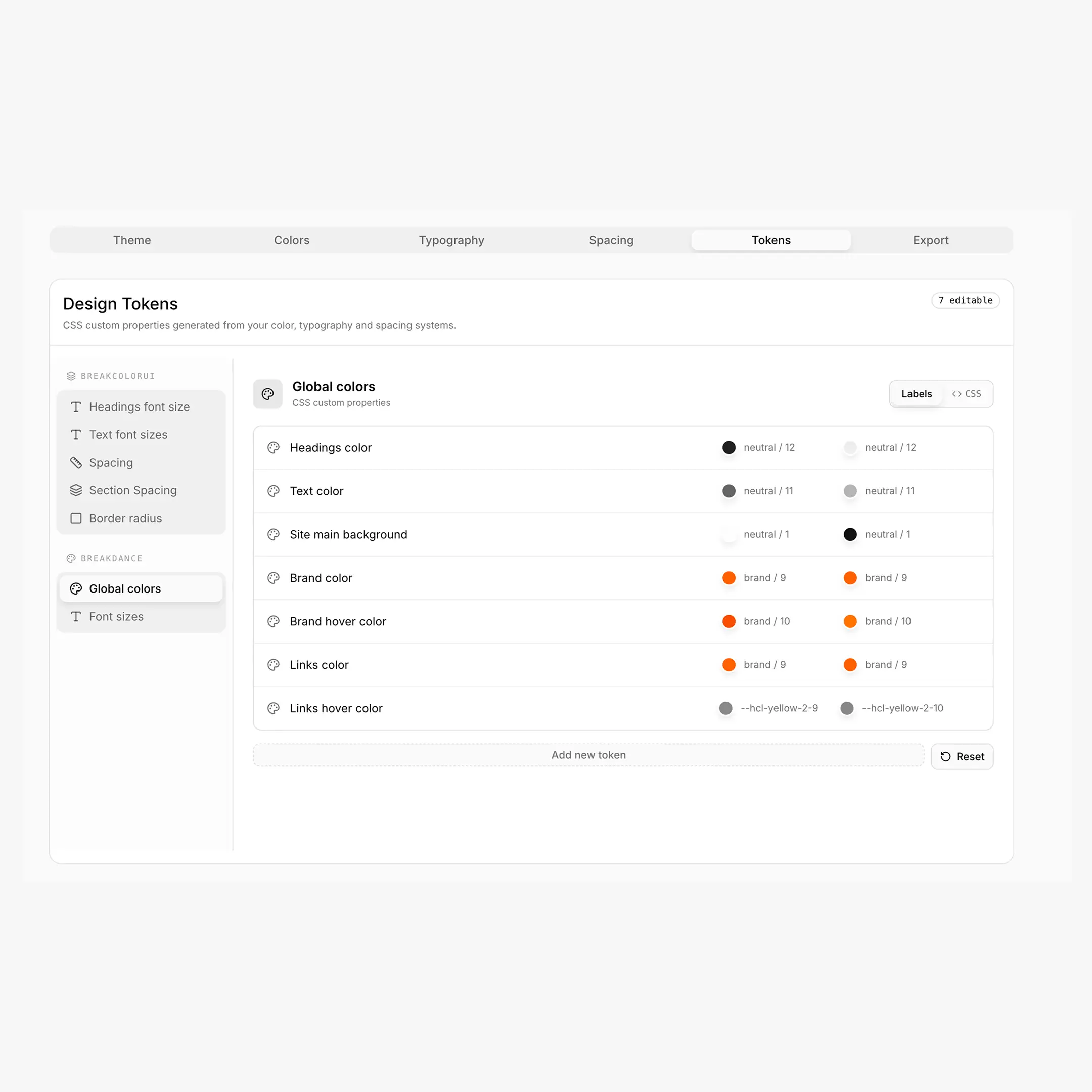
Each panel header has a Label / CSS toggle. Label view shows human-friendly names ("Heading size H1"). CSS view shows the raw CSS variable name (--hfs-h1). Copy buttons always copy the CSS variable name regardless of view.
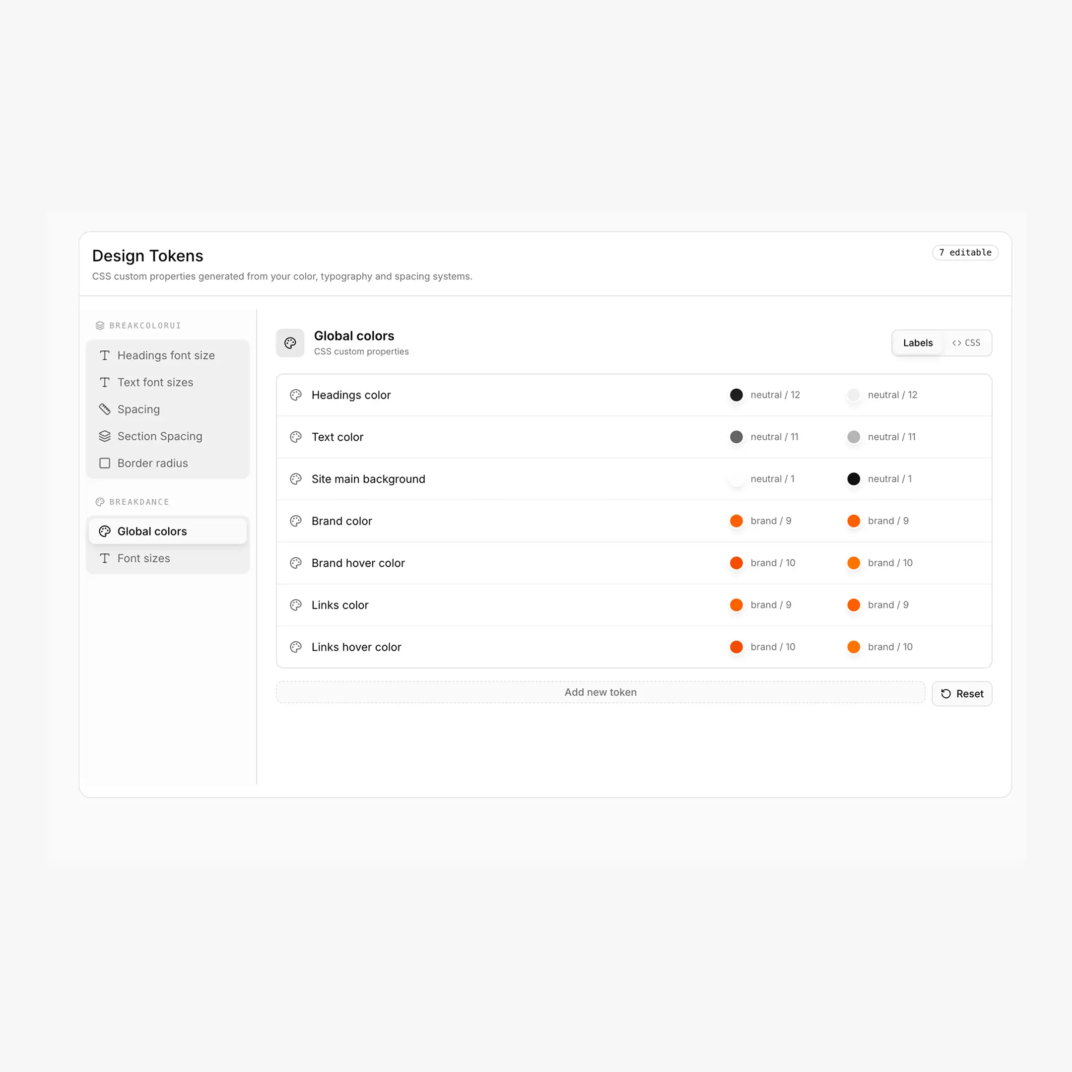
Breakdance: Global Colors
Breakdance ships with a fixed set of semantic global colors that drive headings, body text, background, brand color and links across the builder. BreakColorUI exposes them as --bde-* tokens and lets you map each one to a step from your color palette — separately for Light and Dark modes.
Default mappings
| Semantic token | CSS variable | Default (Light + Dark) |
|---|---|---|
| Headings color | --bde-headings-color | var(--hcl-neutral-12) |
| Text color | --bde-body-text-color | var(--hcl-neutral-11) |
| Site main background | --bde-background-color | var(--hcl-neutral-1) |
| Brand color | --bde-brand-primary-color | var(--hcl-brand-9) |
| Brand hover color | --bde-brand-primary-color-hover | var(--hcl-brand-10) |
| Links color | --bde-links-color | var(--hcl-brand-9) |
| Links hover color | --bde-links-color-hover | var(--hcl-brand-10) |
What each token does in Breakdance
- Headings color drives
h1–h6text site-wide. - Text color is the default body color (paragraphs, lists, generic text).
- Site main background is Breakdance's body background.
- Brand color / hover is what buttons and primary actions use by default.
- Links color / hover controls inline
alinks.
html:root {
--bde-headings-color:           var(--hcl-neutral-12);
--bde-body-text-color:          var(--hcl-neutral-11);
--bde-background-color:         var(--hcl-neutral-1);
--bde-brand-primary-color:      var(--hcl-brand-9);
--bde-brand-primary-color-hover:var(--hcl-brand-10);
--bde-links-color:              var(--hcl-brand-9);
--bde-links-color-hover:        var(--hcl-brand-10);
}
Best practice
Map semantic tokens to var(--hcl-*) references, not raw HEX. That way they automatically follow your light/dark colors when palettes change.
Custom color tokens
Below the defaults you can add your own semantic colors (e.g. Card background, Success color). The CSS variable name is generated from the label:
How custom color tokens are named
- Label → "Card background"
- CSS variable →
--card-background(lowercased, spaces become dashes, special chars stripped) - Set both Light and Dark values, ideally as
var(--hcl-*)references - Each custom token has a delete button if you no longer need it
/* Light + Dark exported separately so the picker stays in sync */
html:root {
--card-background: var(--hcl-neutral-2);
}
Breakdance: Font Sizes (linked)
This panel shows the read-only bridge between Breakdance's font-size variables and your typography tokens. You don't edit anything here — the values follow whatever you configure in the Typography tab.
| Breakdance variable | Linked to |
|---|---|
--bde-h1-font-size | var(--hfs-h1) |
--bde-h2-font-size | var(--hfs-h2) |
--bde-h3-font-size | var(--hfs-h3) |
--bde-h4-font-size | var(--hfs-h4) |
--bde-h5-font-size | var(--hfs-h5) |
--bde-h6-font-size | var(--hfs-h6) |
--bde-body-font-size | var(--hfs-text-m) |
These are written into the export automatically when the platform is set to Breakdance.
BreakColorUI: System tokens
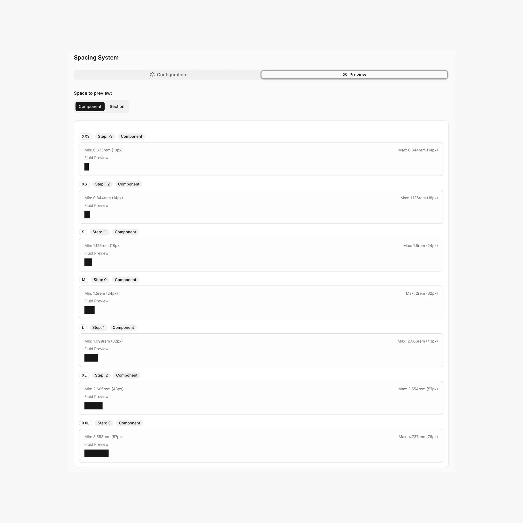
The system collection has five categories, all read-only at the top, with an Add token button at the bottom for extending each scale.
Naming conventions for custom system tokens
When you click Add token in any system category, BreakColorUI auto-picks the next available T-shirt size and generates the CSS variable for you:
| Category | Convention | Direction |
|---|---|---|
| Headings | --hfs-h-{size} | Larger first (e.g. 3xl, 4xl, …) |
| Text | --hfs-text-{size} | Smaller first (e.g. xs, xxs, …) |
| Spacing | --hsp-{size} | Smaller first (e.g. 3xs, 4xs, …) |
| Section spacing | --hss-{size} | Larger first (e.g. 3xl, 4xl, …) |
| Border radius | --hrd-{size} | Smaller first (e.g. xs, xxs, …) |
Min / Max for fluid tokens
Custom typography and spacing tokens are exported as clamp() values built from the min px and max px you provide. Border-radius custom tokens are a single px value.
html:root {
/* Custom Component Spacing */
--hsp-3xs: clamp(0.5rem, 0.42rem + 0.25vw, 0.625rem);
}
Where each prefix comes from
Quick reference for everything BreakColorUI generates:
| Prefix | Meaning | Tab that owns it |
|---|---|---|
--hcl-{palette}-{1..12} | Color step | Colors |
--hcl-on-{palette} | Foreground for solid steps | Colors |
--hfs-h{0..6} / --hfs-text-{l,m,s} | Font sizes (clamp) | Typography |
--hsp-{xxs..xxl} | Component spacing (clamp) | Spacing |
--hss-{xxs..xxl} | Section spacing (clamp) | Spacing |
--page-width / --min-offset / --page-gap | Layout | Theme |
--bde-section-width / -horizontal-padding / --bde-column-gap | Breakdance layout bridge | Theme |
--hrd-{s,m,l,pill,atom} | Border radius | Theme |
--bde-{headings,body-text,background,brand-primary,brand-primary-hover,links,links-hover}-color | Breakdance semantic colors | This tab |
--bde-{h1..h6,body}-font-size | Breakdance font-size bridge | This tab (linked) |
--hsx-bleed-offset | Bleed helper (computed) | Theme |
--hsx-primary-theme | Marks the active theme in Full System exports | Export |
What gets exported
Everything you configure in the Tokens tab is written into the CSS export (see the full export flow):
Export contents
- Breakdance Global Colors —
--bde-*semantic tokens (Light + Dark) - Custom color tokens — your additional
--my-nameentries - Custom system tokens — extra
--hfs-*,--hsp-*,--hss-*,--hrd-*sizes - Linked Breakdance font sizes —
--bde-h1-font-size: var(--hfs-h1)and friends
Troubleshooting
My custom token name doesn't match my label
The CSS variable is generated from the label: lowercased, spaces become dashes, special characters are stripped. Rename the label and the variable name follows.
My token isn't showing up on my site
Tokens are only written when you re-export. Head to Export, copy the CSS, and paste it into Breakdance → Global Settings → Custom CSS (or your project stylesheet). Re-export anytime you change tokens.
Light and Dark mappings drifted
Each Global Color stores Light and Dark independently. If only Light reflects your changes, you probably edited the Light picker only — switch to the Dark picker and update there too. The "Reset" button restores all defaults.