Spacing System
Fluid spacing tokens for components and sections, generated as clamp() values
What is the Spacing System?
In BreakColorUI, spacing is a set of CSS custom properties that hold fluid values (computed with clamp()). Padding, gaps and margins scale smoothly between viewports without needing breakpoints in your own CSS.
Two scales, one source of truth
The Spacing tab exports two parallel scales — one for components (small, internal spacing) and one for sections (large, layout-level spacing). Both are defined globally in html:root so they're available everywhere.
Two scales: component vs section
Both scales share the same 7-step T-shirt sizing: XXS → XS → S → M → L → XL → XXL.
Available tokens
--hsp-xxs
--hsp-xs
--hsp-s
--hsp-m
--hsp-l
--hsp-xl
--hsp-xxl--hss-xxs
--hss-xs
--hss-s
--hss-m
--hss-l
--hss-xl
--hss-xxlPrefix reference
--hsp-*→ HeadSpin Padding (component spacing)--hss-*→ HeadSpin Section (section spacing)- These are different from typography (
--hfs-*) and color (--hcl-*).
When to use each scale
Don't mix the scales
Section spacing values are intentionally much larger than component spacing (multiplied by the section multiplier). Using --hss-* for button padding will look bloated; using --hsp-* for sections will feel cramped.
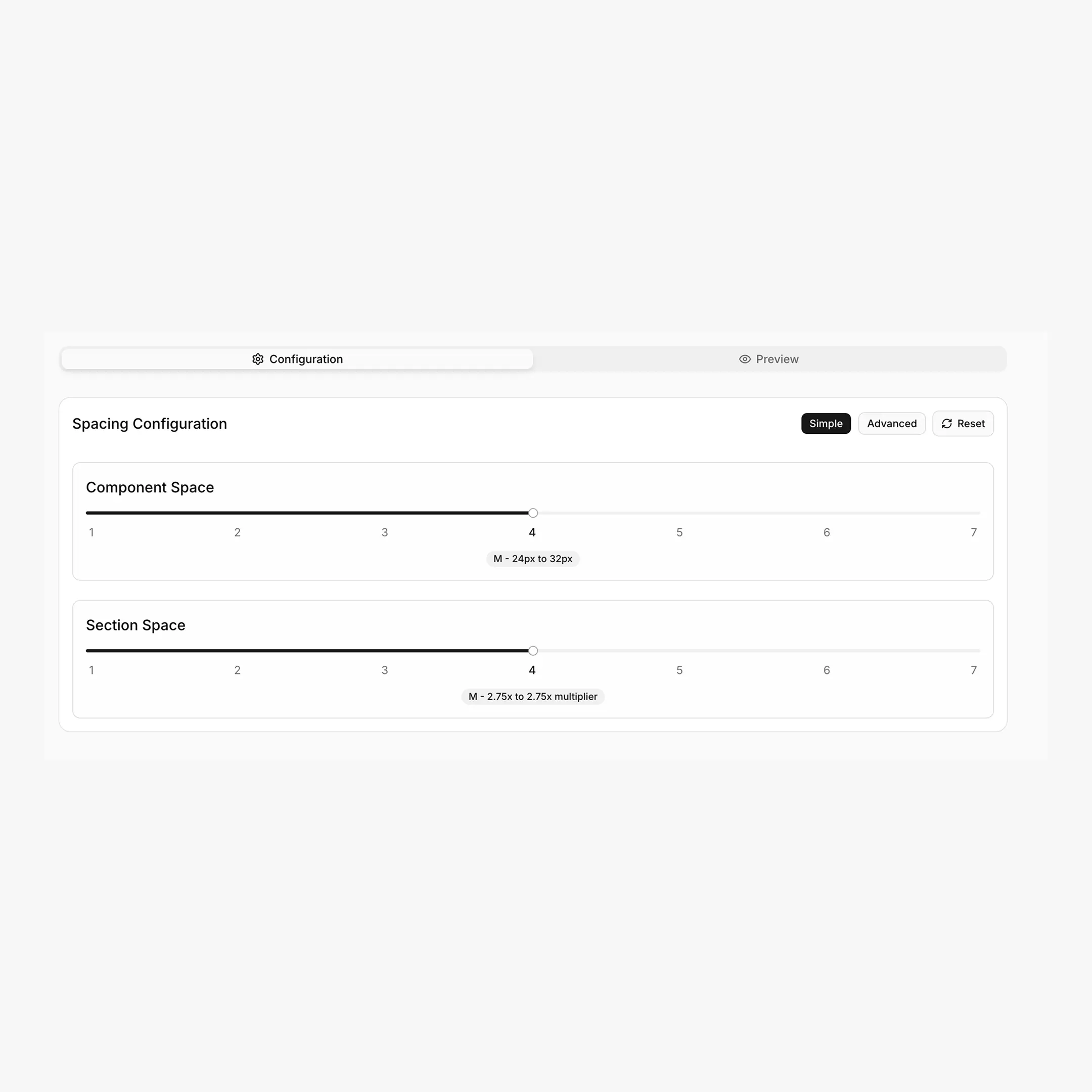
Configuring spacing
The Spacing tab has the same Simple / Advanced split as Typography.
Simple mode
Two independent 1–7 sliders:
Advanced mode
Full control over the min and max viewport values:
Available scale ratios
1.067 · 1.125 · 1.200 · 1.250 · 1.333 · 1.414 · 1.500 · 1.618 — same modular scales used by Typography, plus 1.067 (Minor Second).
How values are calculated
Component tokens use the modular scale directly. Section tokens multiply the result by the section multiplier:
/* Component */
yMin = minSpace * (minScale ^ n)
yMax = maxSpace * (maxScale ^ n)

/* Section */
yMin = minSpace * (minScale ^ n) * minSectionMultiplier
yMax = maxSpace * (maxScale ^ n) * maxSectionMultiplier

clamp(yMin/16 rem, ...vw, yMax/16 rem)
The viewport range is fixed at 479px → 1366px.
Practical usage
.button {
padding: var(--hsp-xs) var(--hsp-s);
}

.card {
padding: var(--hsp-l);
gap: var(--hsp-s);
}

.form {
display: grid;
gap: var(--hsp-s);
}section {
padding-block: var(--hss-l);
}
.hero {
padding-block: var(--hss-xxl);
}
.feature-stack > * + * {
margin-block-start: var(--hss-m);
}Best practice
Prefer gap on flex/grid containers over per-child margins. It composes cleaner and uses spacing tokens uniformly.
Where these variables live
The Export tab places spacing tokens inside the global html:root { ... } block. Paste once into Breakdance → Global Settings → Custom CSS (or your project's global stylesheet) and they're available everywhere via var(--hsp-*) and var(--hss-*).
html:root {
/* Component Spacing */
--hsp-xxs: clamp(...);
--hsp-xs:  clamp(...);
--hsp-s:   clamp(...);
/* ... */

/* Section Spacing */
--hss-xxs: clamp(...);
--hss-xs:  clamp(...);
--hss-s:   clamp(...);
/* ... */
}
Custom spacing tokens
Need an extra step (a --hsp-3xs for hairline gaps, or a --hss-3xl for huge hero sections)? Add them in the Tokens tab — they're auto-named with the next available T-shirt size and exported as clamp() values.