Custom Color Schemas
Add unlimited semantic palettes (success, error, warning, accent...) on top of brand and neutral
What It Does
Custom schemas let you add as many extra 12-step palettes as your project needs. Each one uses the same Radix-style generator as the brand palette, so the steps follow the same UI roles you already know.
Typical use cases:
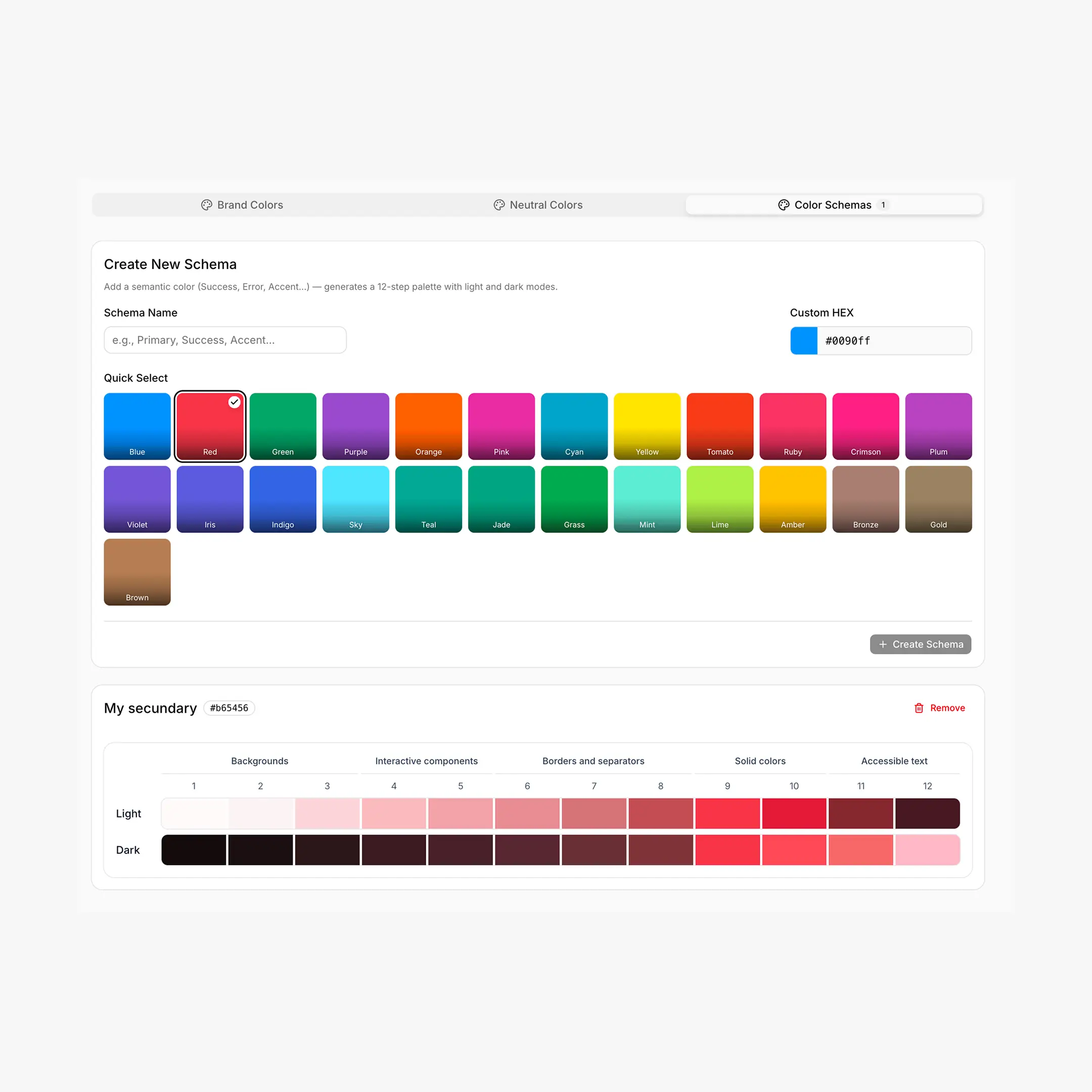
Creating a Schema
Steps inside the Colors tab → Color Schemas
- Type a Schema Name (e.g.
Success,Error,Accent). - Pick a base color — either a Quick Select preset or a custom HEX. Picking a preset auto-fills the name if it's still empty.
- Click Create Schema. The 12-step palette appears below.
- Repeat for each schema you need. Names must be unique.
- To remove a schema, use the Remove button on its card (with a confirm dialog).
- Hit Save.
CSS Output
The schema name is lowercased and any whitespace becomes a hyphen, then it's used in the CSS variable: a schema called Success produces --hcl-success-{1..12}; one called Brand Accent produces --hcl-brand-accent-{1..12}.
/* Success */
--hcl-on-success
--hcl-success-1  ... --hcl-success-12

/* Error */
--hcl-on-error
--hcl-error-1    ... --hcl-error-12

/* Warning */
--hcl-on-warning
--hcl-warning-1  ... --hcl-warning-12
Like brand and neutral, custom schemas work in both light and dark modes via the same [data-hsx*="..."] selectors. The overview page covers how the theme switch is wired.
Recipes
/* Success button */
.btn-success {
background: var(--hcl-success-9);
color: var(--hcl-on-success);
border: 1px solid var(--hcl-success-7);
}
.btn-success:hover { background: var(--hcl-success-10); }

/* Error alert (subtle background, accent border, dark text) */
.alert-error {
background: var(--hcl-error-2);
border-left: 4px solid var(--hcl-error-9);
color: var(--hcl-error-12);
}

/* Warning badge */
.badge-warning {
background: var(--hcl-warning-3);
border: 1px solid var(--hcl-warning-6);
color: var(--hcl-warning-12);
}

/* Destructive button */
.btn-destructive {
background: var(--hcl-error-9);
color: var(--hcl-on-error);
}
.btn-destructive:hover { background: var(--hcl-error-10); }
Enhanced Export
If the Enhanced (v2) export is enabled, every custom schema also receives the same extras as brand and neutral: alpha variants and semantic helpers.
/* For a "success" schema */
--hcl-success-a1 ... --hcl-success-a12   /* transparency */

--hcl-success-contrast    /* readable text over step 9 */
--hcl-success-surface     /* step 1 with ~80% alpha */
--hcl-success-indicator   /* step 9 — for status dots */
--hcl-success-track       /* step 9 — for progress bars */
Best Practices
Name semantically, not visually
Prefer success, error, warning, info over green, red, yellow, blue. If you ever decide your "success" should be teal instead of green, you swap the base color and your CSS doesn't change.
Keep the count small
You can add as many schemas as you want, but every extra palette is 12 (or 24+ with Enhanced) more variables to maintain. Three to five core schemas is plenty for most projects.
Use the same step roles
The 12 steps still mean the same thing across every schema. Steps 1–2 are backgrounds, 9 is solid, 11–12 are text. If you stick to this, swapping a schema's base color is a one-line change.
Chrome Extension & Tokens
- The Chrome Extension lists every schema you've created. Click a Breakdance color input and apply any step from any schema with one click.
- Custom schemas are also wired into the Tokens tab, where you can map them to Breakdance global slots if needed.