Export CSS
Export your design tokens as CSS variables for Breakdance or Oxygen
The Export tab packages everything you configured — colors, typography, spacing, theme — into ready-to-use CSS variables. It's the bridge between BreakColorUI and your live site.
Three ways to use the export
- Paste into Breakdance Global CSS — works in any browser, on any site (see Global CSS Setup)
- Sync to the Chrome Extension — click any color input in Breakdance and apply tokens directly (see Chrome Extension)
- Connect via the WordPress plugin — real-time sync from dashboard to site, no copy-paste (see BreakColorUI Sync)
The 60-second workflow
That's it. The sidebar lets you fine-tune what's included (brand only, no typography, etc.), but the defaults work for most projects.
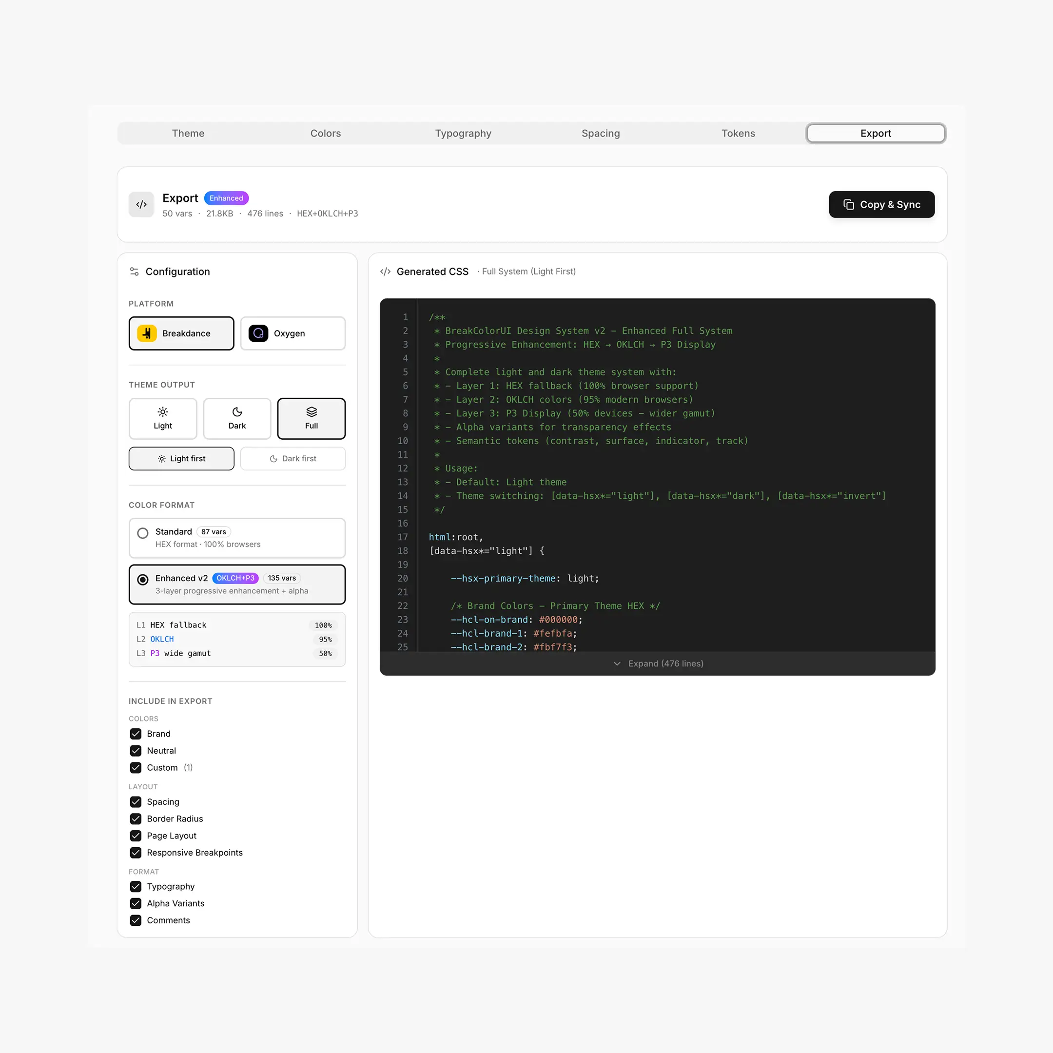
The Configuration sidebar
The left sidebar drives every export. It's split into four blocks:
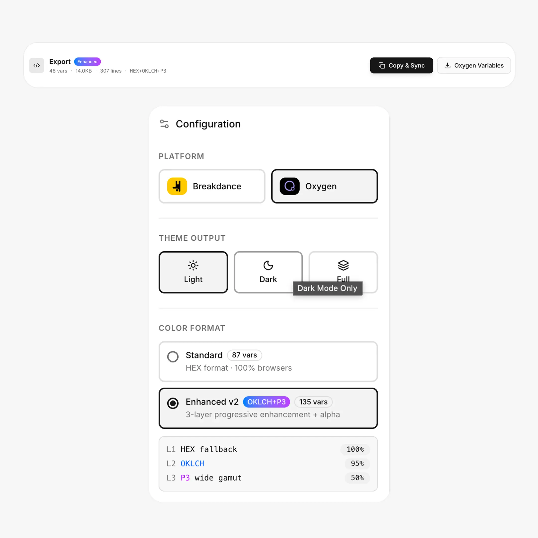
Platform
When you select Oxygen
An extra Oxygen Variables download button appears next to Copy & Sync (only in Light or Dark modes — Oxygen doesn't import light + dark in a single file). The CSS preview is also adjusted to omit Breakdance-specific selectors and globals.
Theme Output
This controls how light and dark are delivered in the exported CSS — not whether you have dark mode at all.
When Full System is selected, you'll see a Light first / Dark first toggle. This sets which theme :root defaults to before the selector flips.
Color Format
This is the choice between Standard (HEX everywhere) and Enhanced v2 (HEX + OKLCH + Display P3). See the Enhanced v2 reference below.
Include in Export
Toggle individual sections on or off:
- Colors — Brand, Neutral, Custom (each independently)
- Layout — Spacing, Border Radius, Page Layout, Responsive Breakpoints
- Format — Typography, Alpha Variants (Enhanced only), Comments
The variable count and file size at the top of the action bar update live as you toggle.
Action buttons
Save before exporting
The export tab will refuse to copy or sync while there are unsaved changes — the dashboard shows a red alert at the top. Hit Save in the global toolbar first.
Output examples
Light only
html:root,
[data-hsx*="light"] {
  /* Brand */
  --hcl-brand-1: #fbfdff;
  --hcl-brand-9: #0090ff;
  --hcl-brand-12: #113264;

  /* Neutral */
  --hcl-neutral-1: #fcfcfc;
  --hcl-neutral-12: #202020;

  /* Breakdance globals */
  --bde-brand-primary-color: var(--hcl-brand-9);
  --bde-headings-color: var(--hcl-neutral-12);
}
Full System (Light first)
html:root,
[data-hsx*="light"] {
  --hcl-brand-9: #0090ff;
  --hcl-neutral-12: #202020;
}

:root[data-hsx*="dark"],
[data-hsx*="dark"],
[data-hsx*="invert"] {
  --hcl-brand-9: #0090ff;
  --hcl-neutral-12: #eeeeee;
}
The same variable name (--hcl-brand-9) resolves to different values depending on the active theme — you write var(--hcl-brand-9) once everywhere.
What gets exported
A full export includes everything your project defines:
Enhanced v2 reference
Enhanced v2 is an opt-in upgrade to the color export. Same variable names, better color quality on capable devices.
What changes
- HEX ships as the universal fallback (works everywhere)
- OKLCH overrides via
@supports (color: oklch(...))on browsers that understand it (~95% today) - Display P3 overrides via
@media (color-gamut: p3)on wide-gamut screens (modern Apple devices) - Alpha variants (
--hcl-brand-a1through-a12) are generated automatically when Alpha Variants is checked - Semantic tokens (
--hcl-brand-contrast,--hcl-brand-surface,--hcl-brand-indicator,--hcl-brand-track) are pre-calculated for common UI patterns
/* Layer 1 — universal fallback */
:root { --hcl-brand-9: #0090ff; }

/* Layer 2 — modern browsers */
@supports (color: oklch(50% 0.2 0)) {
  :root { --hcl-brand-9: oklch(65.4% 0.182 30.39); }
}

/* Layer 3 — wide-gamut screens */
@media (color-gamut: p3) {
  :root { --hcl-brand-9: color(display-p3 0.875 0.565 1); }
}
You write var(--hcl-brand-9) everywhere. The browser picks the best layer it can render. File size grows by roughly 15%; total variable count goes from 51 to 86+ per 3-palette setup.
When Enhanced v2 is worth it
- You're targeting Apple devices (Display P3 is the noticeable bump)
- You need transparency variants for overlays, hover states, focus rings
- You use the semantic tokens (contrast, surface, indicator, track) instead of hand-picking steps
Otherwise, Standard is leaner and identical in result on most sRGB monitors.
Project Backup (Pro)
Below the main export there's a collapsible Project Backup panel. It exports a JSON file containing the full project configuration — colors, typography, spacing, theme, and your export settings. Use it to:
- Move a project between accounts
- Snapshot a known-good state before experimenting
- Hand off a design system to another developer
Import accepts the same JSON. This is a Pro feature; on the free tier the buttons are disabled.