Typography System
Fluid typography that scales smoothly from mobile to desktop using clamp()
Try it
Drag the slider to see how each font size scales between the minimum viewport (479px) and the maximum viewport (1366px).
How it works
BreakColorUI generates a fluid type scale using CSS clamp(). Each token has a minimum size (used at small viewports), a maximum size (used at large viewports), and a smoothly interpolated value in between. No @media breakpoints required.
/* Generated by BreakColorUI */
--hfs-h1: clamp(2rem, 0.140rem + 0.961vw, 3.2rem);
--hfs-h2: clamp(1.75rem, 0.105rem + 0.842vw, 2.5rem);
--hfs-text-m: clamp(1rem, 0.932rem + 0.225vw, 1.125rem);
Available tokens
The typography system ships with 7 heading tokens (H0 to H6) and 3 text tokens (Large / Medium / Small).
/* Headings */
--hfs-h0
--hfs-h1
--hfs-h2
--hfs-h3
--hfs-h4
--hfs-h5
--hfs-h6

/* Body text */
--hfs-text-l
--hfs-text-m
--hfs-text-sConfiguring typography
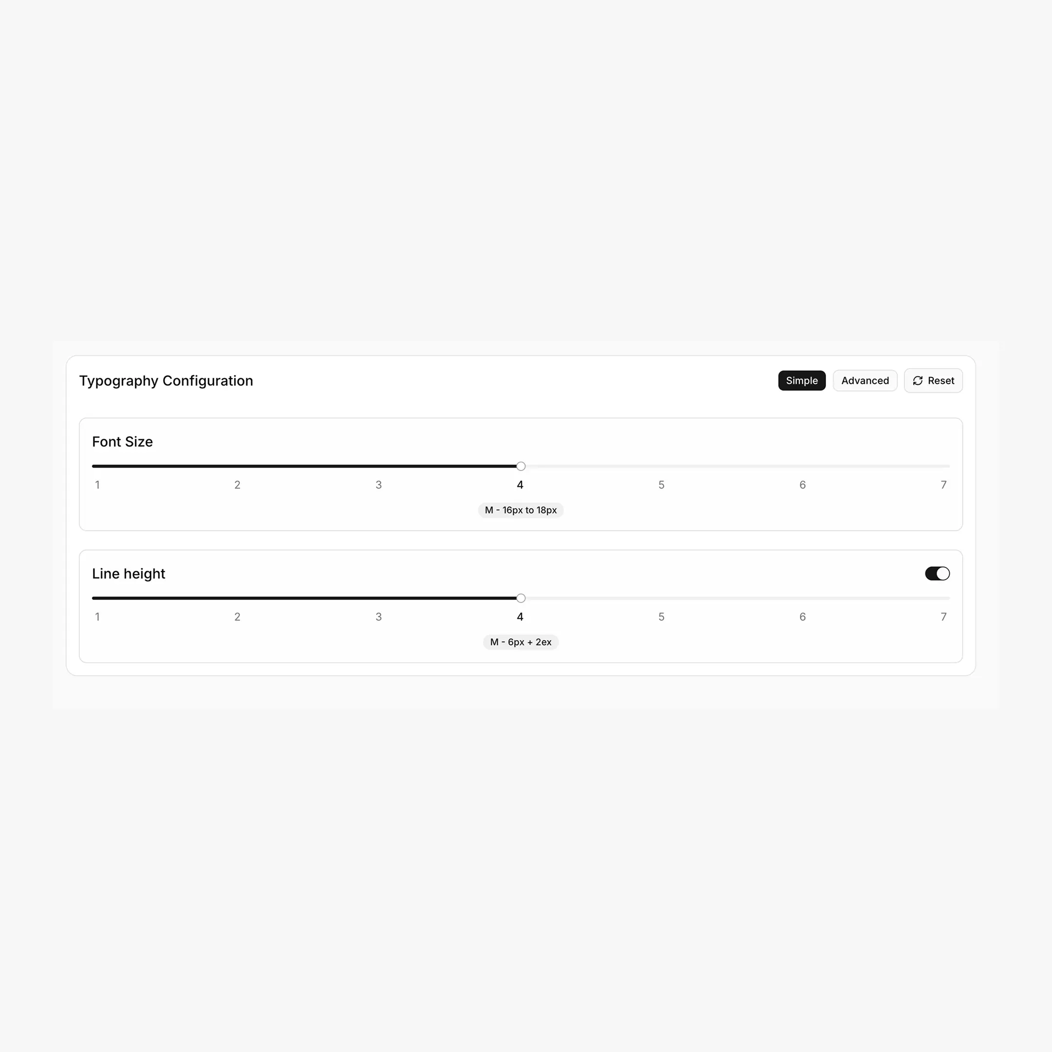
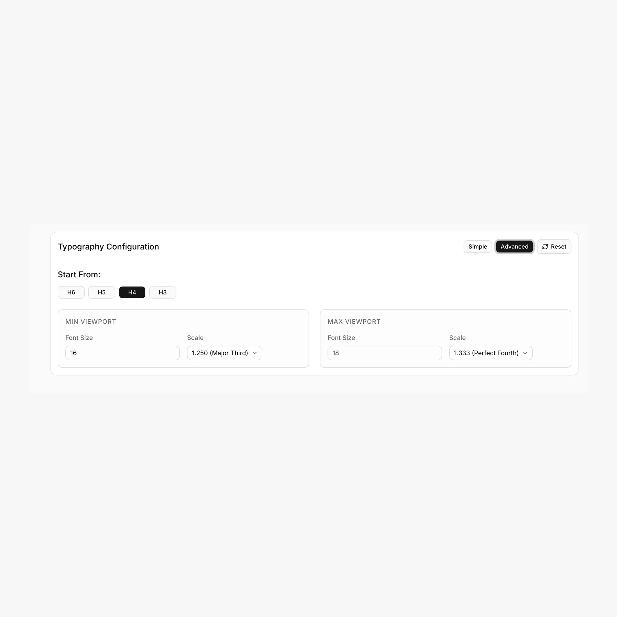
The Typography tab has two configuration modes: Simple (a single slider) and Advanced (full control over each viewport).
Simple mode
A 1–7 slider chooses a preset that controls all parameters at once. Each step has its own min/max font size, min/max scale ratio, and "active lock" (the heading from which scaling starts).
Recommended steps
- Step 1–2 (XXS / XS): subtle scale, long-form reading sites
- Step 4 (M): balanced default for most marketing sites
- Step 6–7 (XL / XXL): dramatic scale, design-heavy landing pages
Advanced mode
Lets you override every parameter independently:
Available scale ratios
1.125 (Minor Second) · 1.200 (Minor Third) · 1.250 (Major Third) · 1.333 (Perfect Fourth) · 1.414 (Augmented Fourth) · 1.500 (Perfect Fifth) · 1.618 (Golden Ratio)
How clamp values are calculated
For a token with step n from the base:
yMin = minFont * (minScale ^ n)
yMax = maxFont * (maxScale ^ n)

clamp(
yMin / 16 rem,
computed-rem + computed-vw,
yMax / 16 rem
)
The viewport range used by BreakColorUI is fixed at 479px → 1366px.
Line height
Line height is configured separately with its own 1–7 slider (XXS to XXL). When enabled, BreakColorUI adds a single CSS rule applied to h1, h2, h3, h4, h5, h6, p, div:
h1, h2, h3, h4, h5, h6, p, div {
line-height: calc(6px + 2ex);
}
No --hfs-lh-* variables
Line height is not exported as individual CSS variables. It's a single line-height: calc(Xpx + Yex) rule that scales naturally with each element's font size. Toggle "Line height" off if you'd rather control it yourself.
Usage
h1 { font-size: var(--hfs-h1); }
h2 { font-size: var(--hfs-h2); }
h3 { font-size: var(--hfs-h3); }

p           { font-size: var(--hfs-text-m); }
.lead       { font-size: var(--hfs-text-l); }
.caption    { font-size: var(--hfs-text-s); }
Where to paste this
The Export tab ships the full block inside html:root { ... }. Paste it once into Breakdance → Global Settings → Custom CSS, or into your project's global stylesheet. See the Export guide for the full flow.
Breakdance integration
When exporting to Breakdance, BreakColorUI also wires the framework's font-size variables to your typography tokens automatically:
--bde-h1-font-size: var(--hfs-h1);
--bde-h2-font-size: var(--hfs-h2);
/* ... h3-h6 ... */
--bde-body-font-size: var(--hfs-text-m);
This means changing your typography in BreakColorUI updates Breakdance's heading and body sizes site-wide. See Tokens for the complete mapping table.
Custom typography tokens
Need extra sizes (a --hfs-h-3xl for hero displays, or a --hfs-text-xs for tiny labels)? You can add them in the Tokens tab — they're exported as clamp() values just like the system tokens.