Brand Colors
Generate a 12-step palette from a single brand hex
What It Does
Pick one base color and BreakColorUI generates a complete 12-step Radix-style palette for both light and dark modes. The base color sits at step 9 (the "solid" action color); step 10 is a slightly darker hover; the rest are derived using a hue/saturation/lightness algorithm against a set of reference Radix palettes.
The base color you pick is step 9
If you type #0090ff, then --hcl-brand-9 will be exactly #0090ff in light mode. The other steps are calculated relative to it.
Try It
Pick a brand color (or any neutral) and watch the full system regenerate live, including light and dark modes.
Configuring in the Dashboard
Steps inside the Colors tab → Brand
- Pick a preset from Quick Select (24 Radix-tuned presets: Blue, Red, Green, Tomato, Iris, Jade, Mint, Amber, etc.) — the schema name auto-fills.
- Or type any HEX in the input (a native color picker is built in).
- The 12-step grid below previews the generated palette in both modes.
- Click Reset to return to the default Blue brand schema.
- Hit Save to persist.
CSS Output
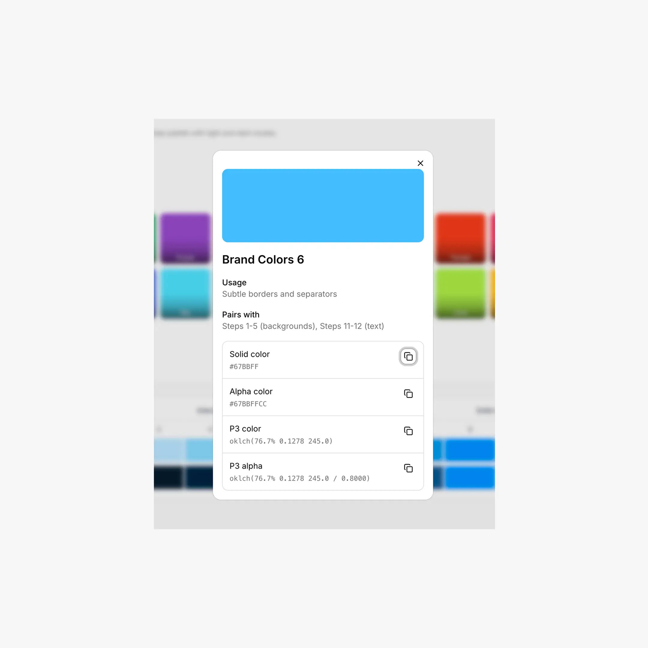
Brand colors are exported as --hcl-brand-{1..12} plus an --hcl-on-brand token (a readable text color computed against step 9 using a luminance contrast check).
/* Light theme */
html:root,
[data-hsx*="light"] {
--hcl-on-brand: #ffffff;
--hcl-brand-1:  #fbfdff;   /* app background */
--hcl-brand-2:  #f4faff;
--hcl-brand-7:  #8ec8f6;   /* border */
--hcl-brand-9:  #0090ff;   /* solid (your input color) */
--hcl-brand-10: #0588f0;   /* hover */
--hcl-brand-12: #113264;   /* high-contrast text */
}

/* Dark theme — same variable names, different values */
:root[data-hsx*="dark"],
[data-hsx*="dark"],
[data-hsx*="invert"] {
--hcl-brand-1:  #0d1520;
--hcl-brand-7:  #205d9e;
--hcl-brand-9:  #0090ff;
--hcl-brand-12: #c2e6ff;
}
Light-only or Dark-only exports
If you don't need theme switching, the Export tab can emit a flat version that applies one theme directly to :root with no data-hsx selectors. See Export.
Using Brand Colors
/* Primary button */
.button {
background: var(--hcl-brand-9);
color: var(--hcl-on-brand);
border: 1px solid var(--hcl-brand-7);
}
.button:hover { background: var(--hcl-brand-10); }

/* Subtle brand-tinted card */
.card {
background: var(--hcl-brand-2);
border: 1px solid var(--hcl-brand-6);
color: var(--hcl-brand-12);
}

/* Outline / ghost button */
.button-ghost {
background: transparent;
color: var(--hcl-brand-11);
border: 1px solid var(--hcl-brand-7);
}
Enhanced Export Adds More
When the Enhanced (v2) export is on, brand colors also produce alpha variants and semantic helpers — handy for overlays, focus rings, and progress tracks without writing your own rgba() math.
/* Transparency variants */
--hcl-brand-a1  ... --hcl-brand-a12

/* Semantic helpers, computed from the palette */
--hcl-brand-contrast    /* readable text over step 9 (= --hcl-on-brand) */
--hcl-brand-surface     /* step 1 with ~80% alpha for glassy backgrounds */
--hcl-brand-indicator   /* step 9 — badges, status dots */
--hcl-brand-track       /* step 9 — sliders, progress bars */
Breakdance Mapping
Inside the Breakdance editor, your brand colors are exposed through the global color slots — --bde-brand-primary-color (= --hcl-brand-9), --bde-brand-primary-color-hover (= --hcl-brand-10), --bde-links-color, and so on. The mapping is configurable in the Tokens tab.
Chrome Extension shortcut
With the Chrome Extension installed, you can click any color input in the Breakdance builder and apply a brand step directly — no copy-pasting variables.